Morning folks! I hope everyone’s month of May is chugging along nicely - I seriously cannot believe how fast this month has flown by! This month I decided to continue to talk more about craft fairs. For most of us makers who sell at craft fairs, the season doesn’t really get into full swing until about May/June (maybe late April), so I feel like a second craft fairs related post is timely for most.
Today I want to focus on one main topic: effective displays. Such an important and nuanced part of selling your work at craft fairs!
Your display matters at least as much as the quality of the product you are selling. Without a great display you’re going to have a difficult time pulling customers into or up to your booth as they walk along, taking in many points of visual stimuli at once. Your display needs to be pleasing to the eye, but also needs to make sense with your brand. Sometimes a great display will actually be rather simple, as that can be the best way to let the items shine.
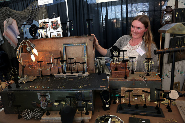
When I put my display together at craft fairs, I often think of the fashion editor, Diana Vreeland, who was known to say “The eye has to travel.” You need to give your audience various points of visual interest so if the first thing their eyes land on is not to their liking, they can naturally find something else of interest to take in. To put it much more simply: create layers of height and depth in your display! There are many different ways to do this, from commercial risers that you can buy, to a basic cardboard box or container hidden underneath a table cloth, to more interesting elements like old trunks, and wooden fruit boxes. Obviously, I am most adept at creating displays for jewelry, but the basic concept of creating height and layers to a display can apply to most any product.
I belong to the SF Etsy team, and one of their wonderful members (Lisa Spinella of Tickle and Smash) has put together a Pinterest board that has a lot of great inspirational photos to help you out with display ideas if you’re not sure where to start. Another great place to look is through the online photo albums that various craft fairs will put together and make avaible to the public after an event has passed. Renegade, West Coast Craft, and Urban Air Market are just a few great ones. When you look at photos of others’ displays I encourage you to take inspiration from these great displays and make it your own. Just as we, as artists, do not want to copy others’ work or have our work copied, to blatantly copy another’s booth display is not the best idea either. You also want your display to make a mark, and if you look too much like other vendors, you will loose this great opportunity to form a lasting memory in people’s mind.
Creating a beautiful display doesn’t have to cost a lot either. My display has evolved over the years, but early on I simply used cardboard boxes of varying heights hidden under pretty cloths or tablecloths to create different heights and layers in my display.
Another important part of your display will be your pricing. Specifically, making your pricing easy to find and read and understand. Whether you choose to price each item individually, or create price signs for items that are all the same price, is up to you. The easier you make it for your customer to find the prices and understand them the more likely your customer is to stick around and look for a while and hopefully buy. Many customers want to be able to compare and shop around through your display, selecting an item or items that fit two categories: fall into their budget and are pleasing to their tastes. If they have to ask over and over again what the price is on an item, they will often loose interest and venture elsewhere. If you’ve priced everything clearly and someone still asks for the price on an item, always respond politely! I tend to reply by saying something like this: “That necklace is $40. And if you’re wondering about the price on any other necklaces, just look for the gold tag on the chain.” I’ll then point out the prices and mention something like “it’s easy to miss these!” Basically I do everything I can to make the customer NOT feel stupid for asking about the price. I can’t tell you how many vendors will simply reply, vaguely about the price being on the tag leaving the customer to feel like they were an inconvenience. I don’t think I need to say this, but your customer is not an inconvenience!
You also want to think about creating a space for any promotional or branding materials you may have. Business cards, flier or postcards for other upcoming events you may have scheduled, and a newsletter sign up form all fall into this category.
Overall I find it helpful to look at your display as your main way to communicate the essence of your brand. It is the thing that people will notice before they notice your product as they meander through busy events. And it is often the thing that will either draw them in, or make them decide to walk the other way. Also of import: clear signage indicating what your business’s name is. This is twofold: as you develop a following people may come out to events specifically looking for you. And two, you want people who like your work to remember you. Clear brand signage will make that much much easier.
I want to wrap this post up by emphasizing oner thing: you can always change it up! If at the first event you venture out to, you find that your display does not work for you the way you need it to, then dedicated yourself to trying something else at your next event. (This is good advice regarding any area of your handmade business: you can always change whatever it may be if it's not working the first way your conceived of it!)
Good luck in all of your craft fair adventures this craft fair season! Now I'd love to hear from you guys - what's been an effective displaying technique for you? What really hasn't worked? I'd also love to hear any of your fun or unusual craft fair stories in the comments below.
Have a wonderful Tuesday!


